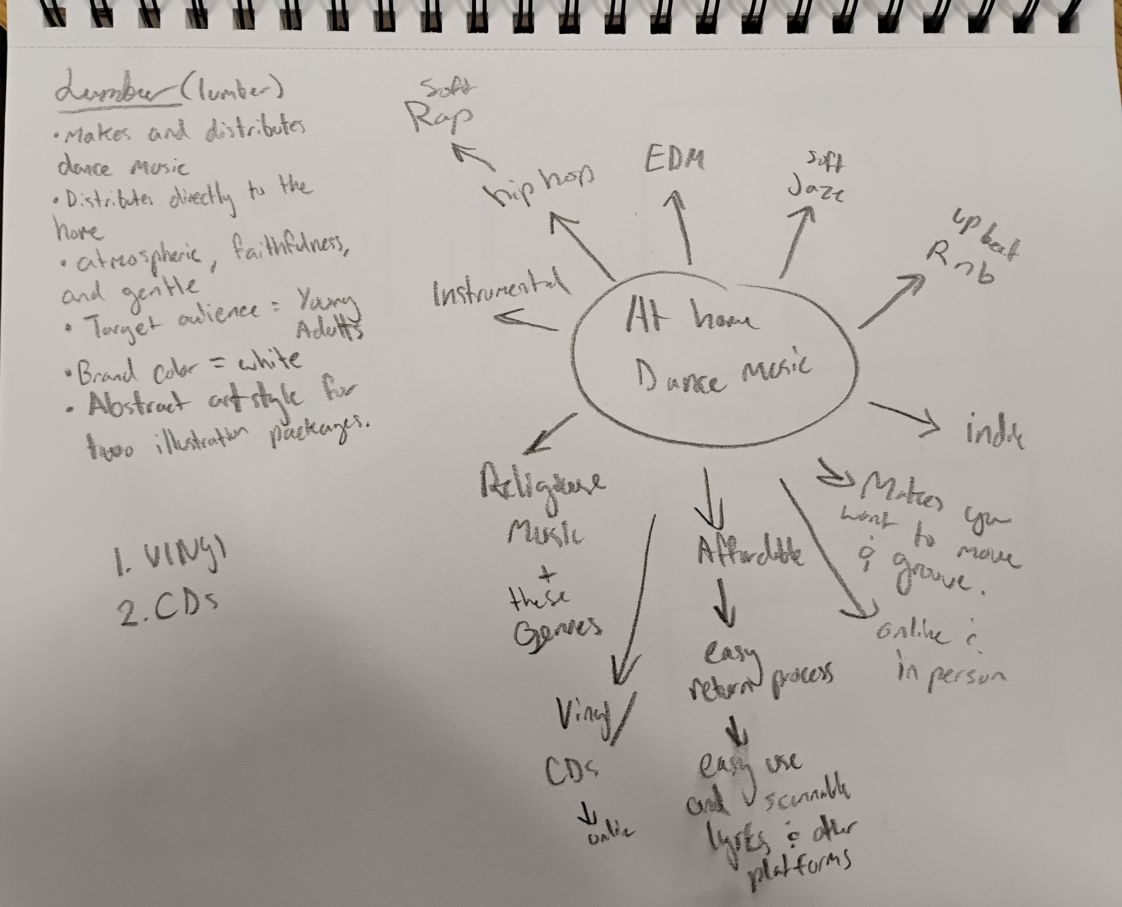
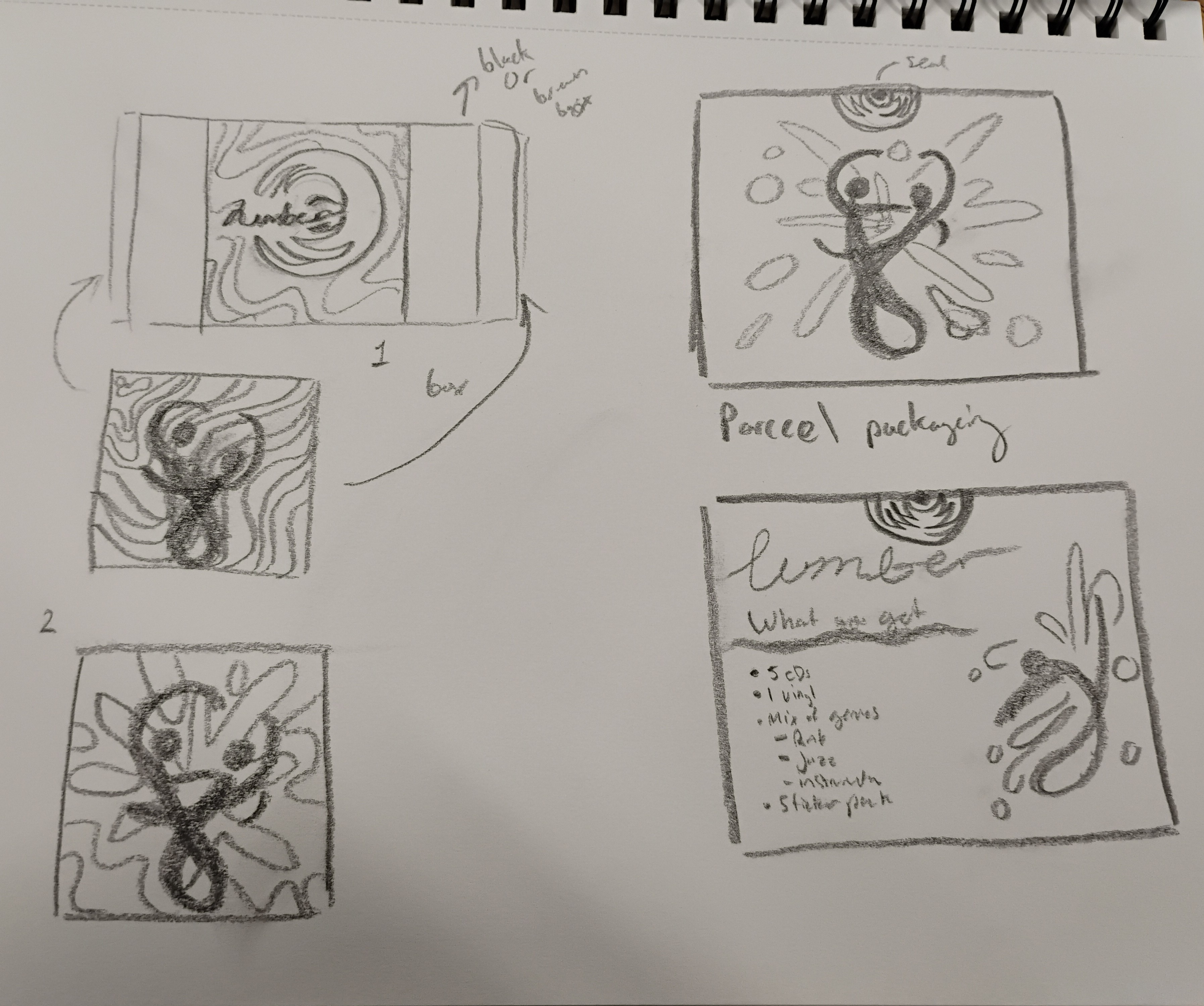
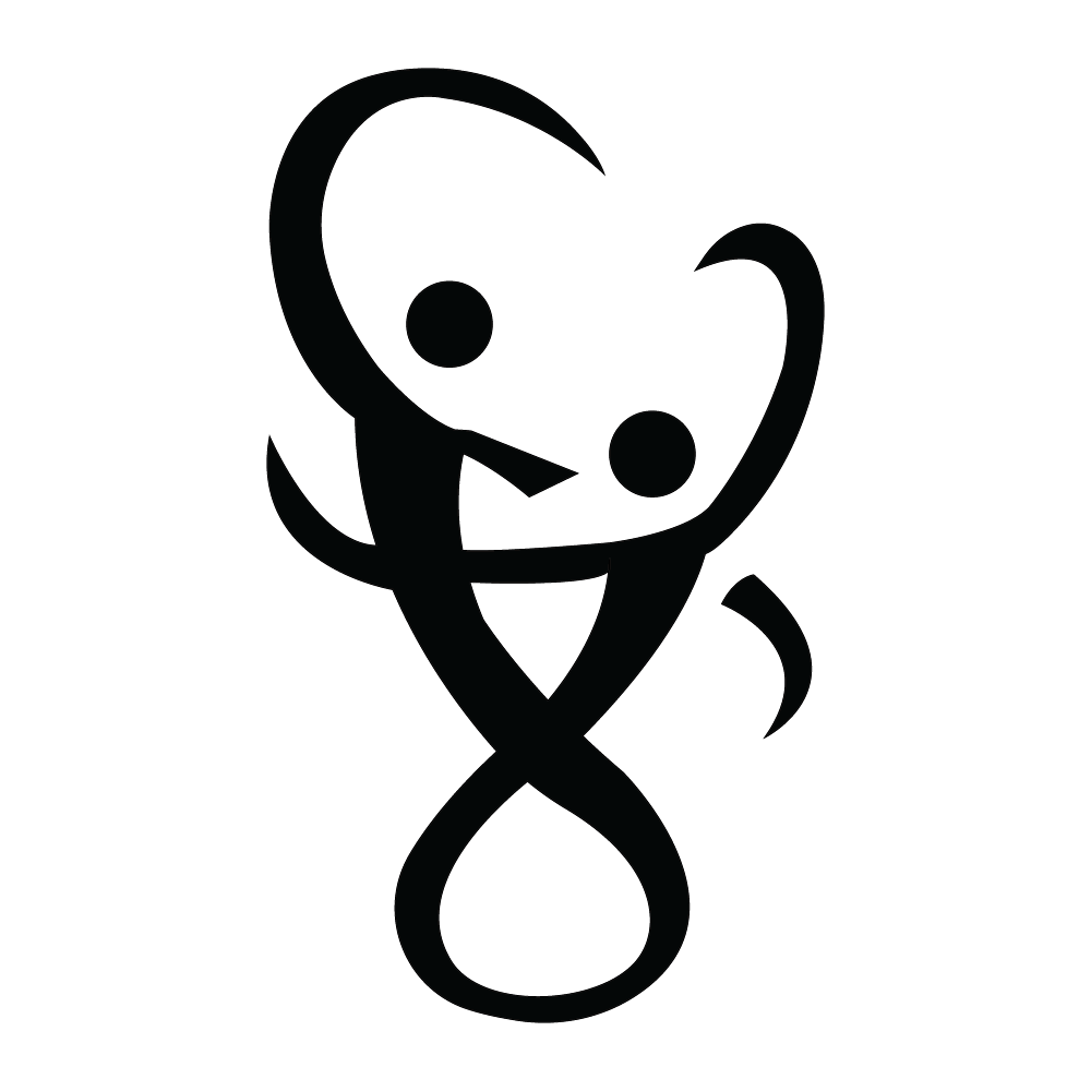
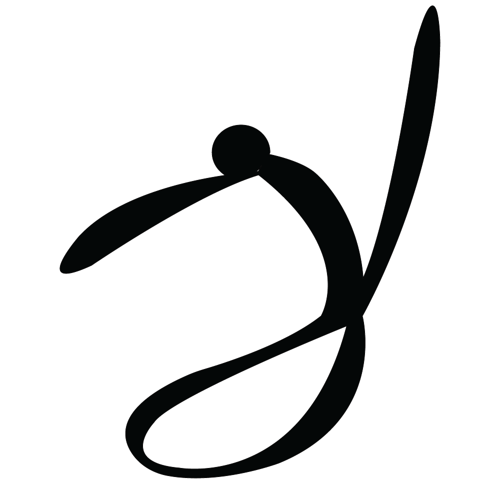
Lumber's Groove to the Move

Logo and package design

Design Problem: With a wide variety of streaming services, live music and digital media intake, the possibility for music is endless but can be expensive with subscription or wanting to indulge in collecting CDs and Vinyl’s. And finding the right song or vibe for the groovy mode without ads or getting overwhelmed trying to look for the right track is exhausting. That is where Lumber comes in. We create and distribute music from artists all around the world looking for that groovy itch that moves your body at an affordable price. From Jazz to R&B to simply instrumentals for you to focus on too, we’ve got upbeat dance music for everyone’s needs. Shipped directly to your home with two care-packaging options, a vinyl and CD set or create your own with additional merchandise and CDs. Along with physical music, we send a QR code with every purchase to download the music digitally or have subscription options available online.

Design Solution: I want to indulge in the faithful and gentle flowing feeling of dance music as well as the upbeat of young adults’ energy with the type of music Lumber creates. The Vinyl only made sense because they are coming back in style with the younger generation and still allude to an older one as well. As for the packaging, keeping fun colors as well as white as a base helped create that fun flowing feeling that I was trying to capture. Using the gradient helped add a trendy atmosphere that I was looking for.

Audience: Young Adults

Software: Adobe Illustrator, Adobe Photoshop.

Lumber Logo

Lumber Vinyl font packaging
Lumber Vinyl back packing
Lumber Custom packaging

Design Process

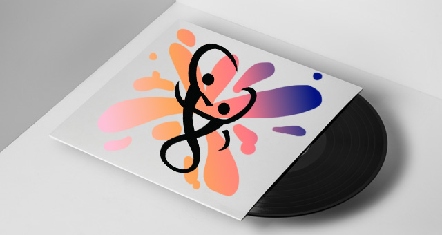
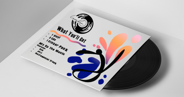
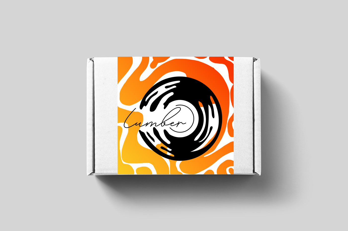
Design Process: Initially hearing from the brief, I instantly knew I wanted some swirls and flowing feeling on the packaging. The colors didn’t come to mind until I started creating in photoshop, but the gradient made all the difference. I first started with a map of the company so I can get a feeling of what direction to go to. Was it more pop music, rock or EDM? What feeling am I trying to go for? Then I had to decide on the logo. The Logo had a few workshopping directions. I wasn’t sure if I wanted just the name with some calligraphy or have a sans-serif font. At first, I didn’t sketch the logo, but I did create a seal on my sketches and that is where I got the idea for the company logo. Furthermore, The people icons were a little difficult at first because I wanted to utilize the white spacing as well but overall I’m glad I made them because it brought the packaging together in the best way.

Map of the company
Sketches

people dancing
single person dancing