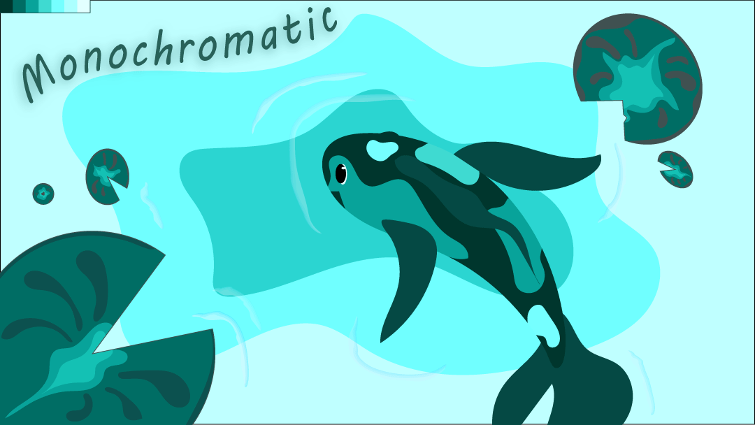
For this design, I wanted a calm, relaxed theme. In color psychology, according to koboto.org, blue and teal mean calm, trust, and stability. Keeping in mind the theme, going with lighter colors made me think of the ocean and that led me to thinking about the koi fish from the public library. The public library is the calmest place for me, next to going swimming or water in general.
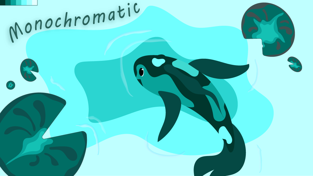
For the revision of this piece, feedback given was to balance the elements better. The koi’s fin didn’t fit right with the angel the fish was swimming. As well as, the Lilly pads conflicted with the attention of the page between them and the fish. Overall, the colors, text, and little touches I added with the brush tool helped give movement to the piece and capsulate the calm feeling I was attempting to give. I used references of koi fish to fix the tail, and I think it helps give the piece better movement. I also adjusted the size of the large Lilly pad in the bottom left corner and rotated the slits of the other Lilly pads to face towards the middle to use leading lines effectively and utilize negative space between them.