


Design Process
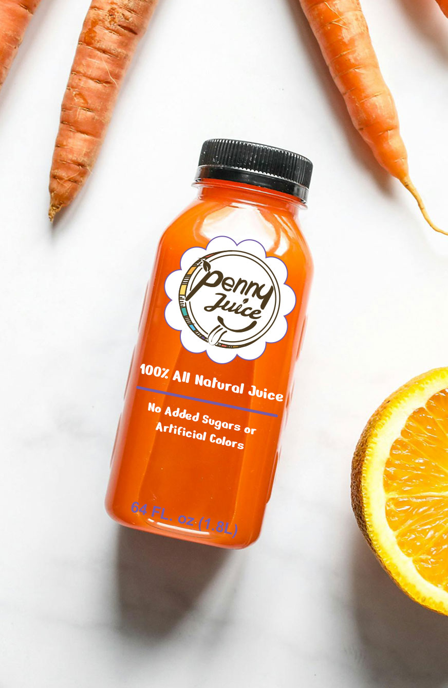
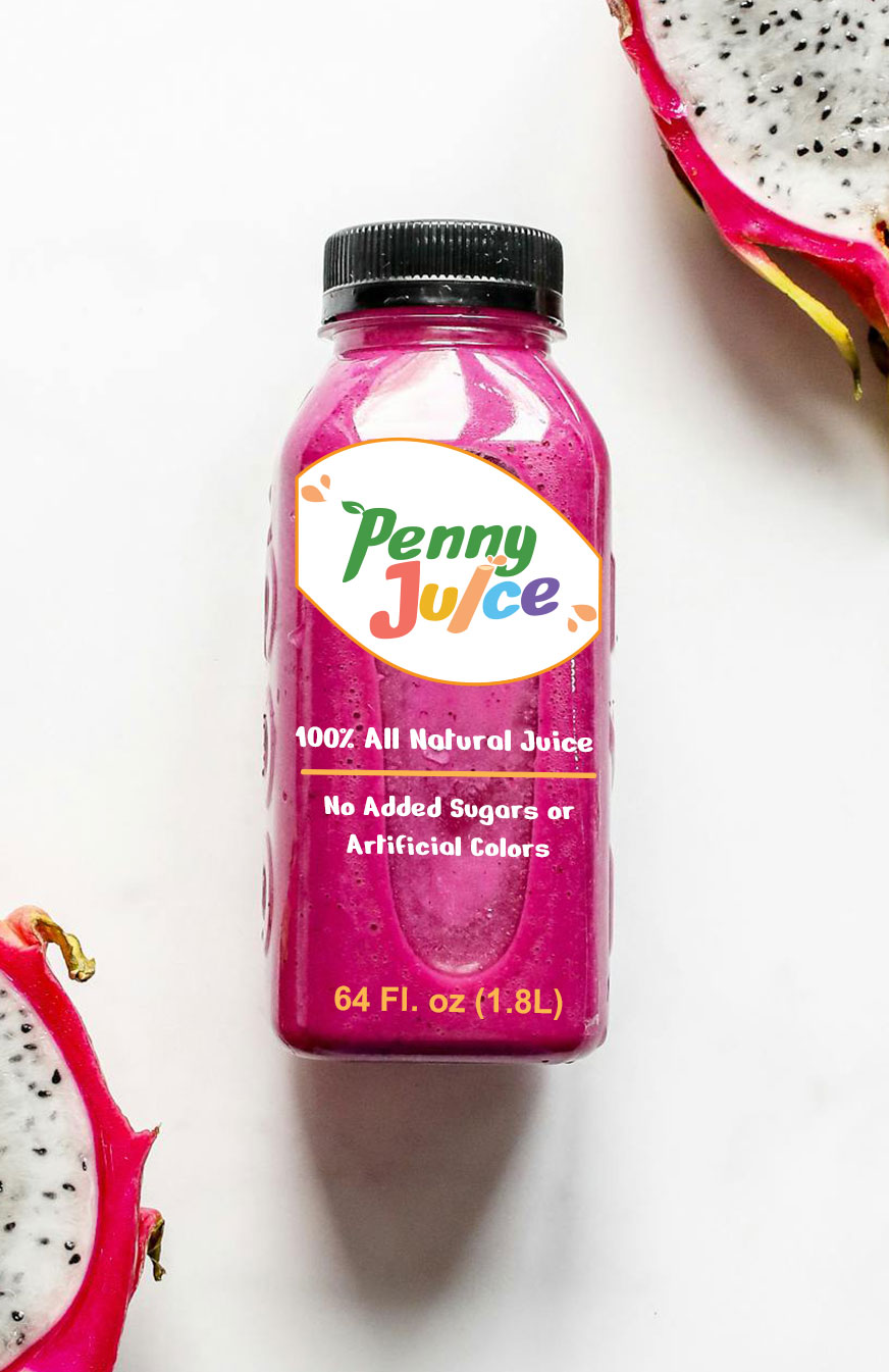
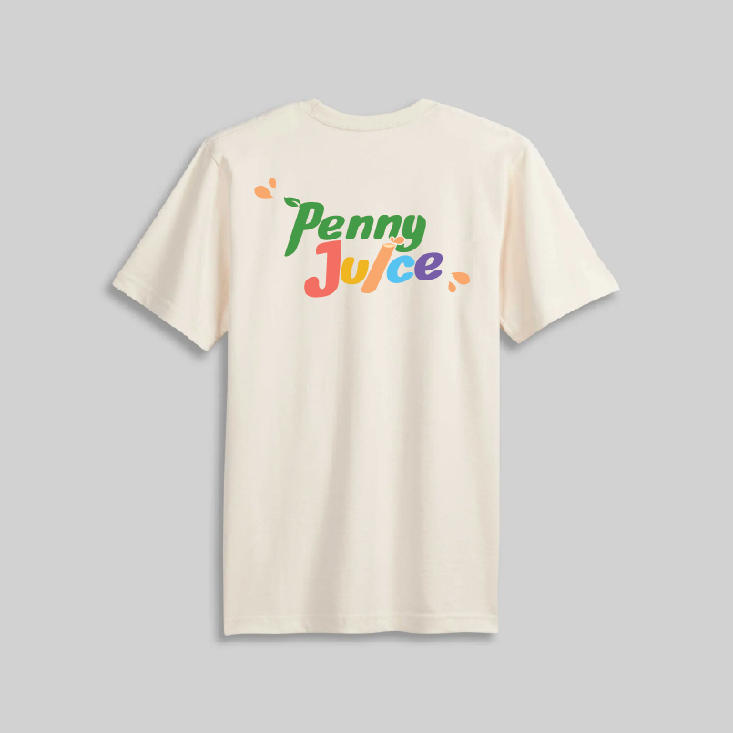
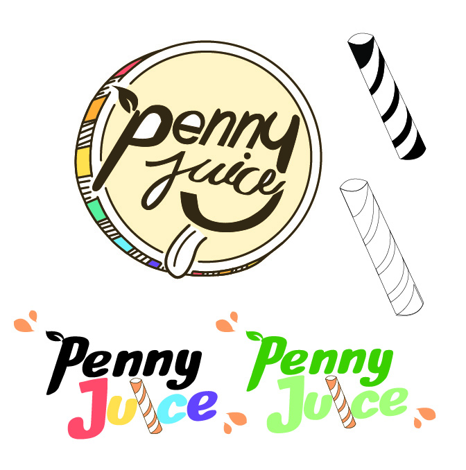
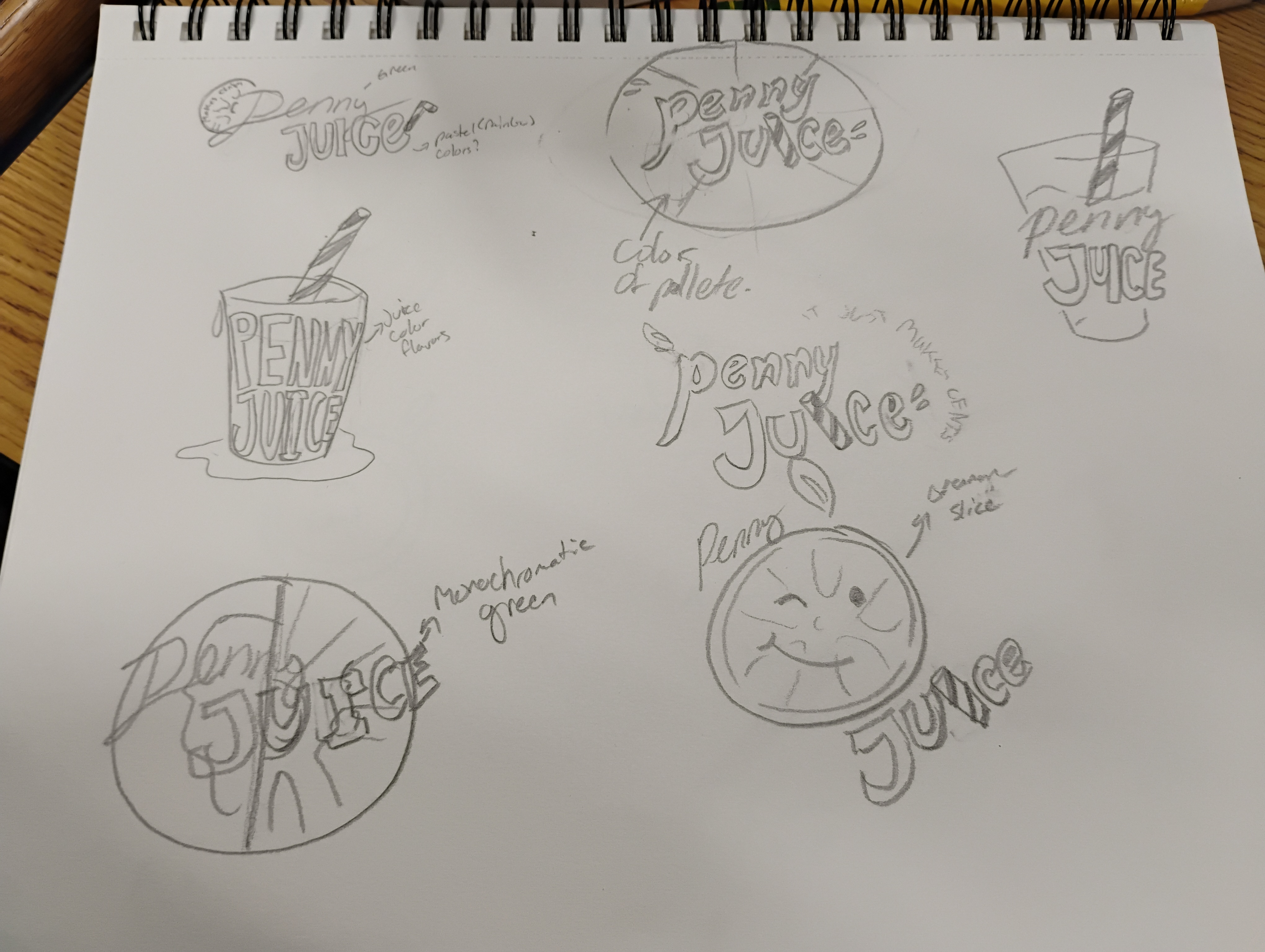
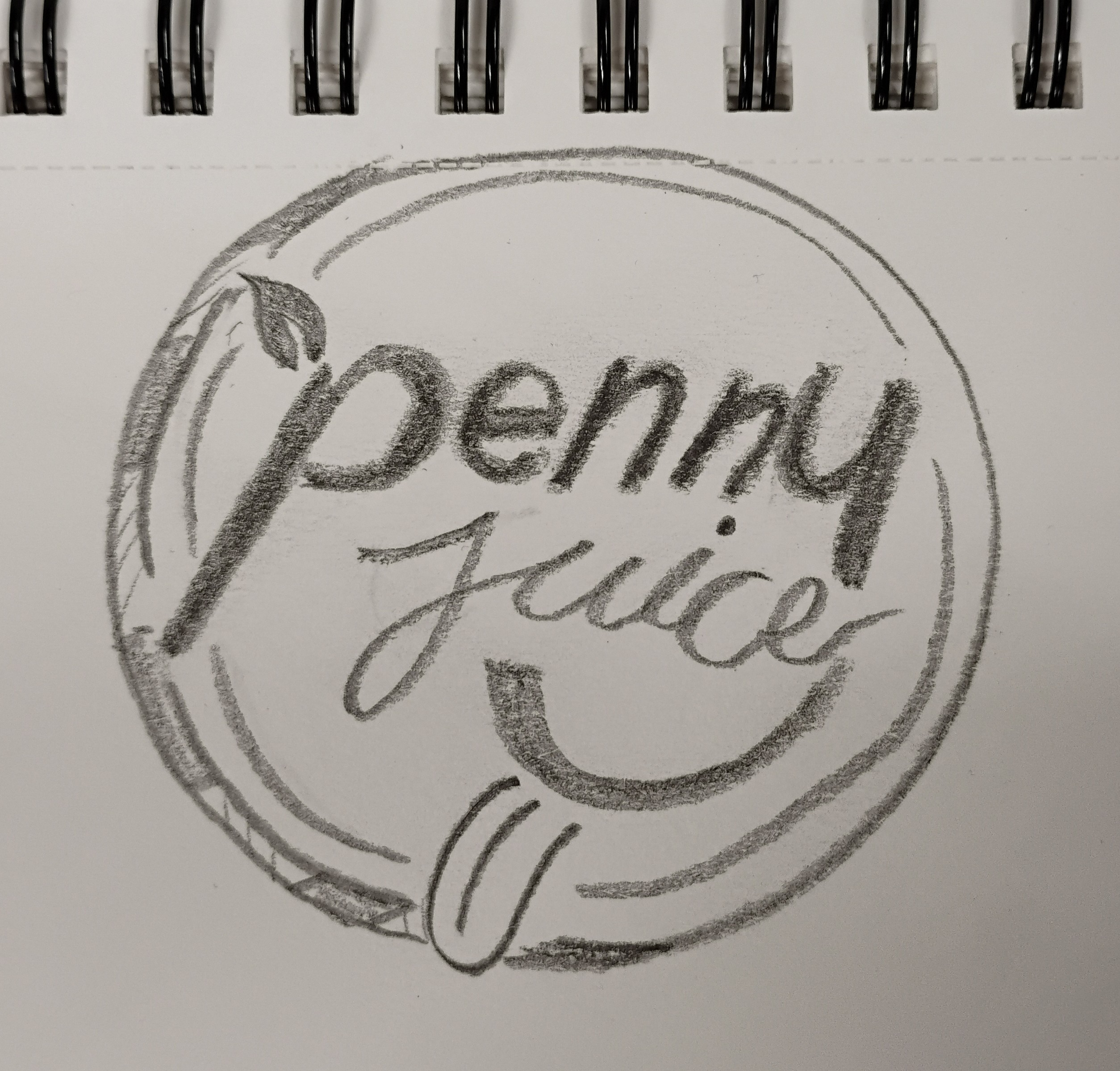
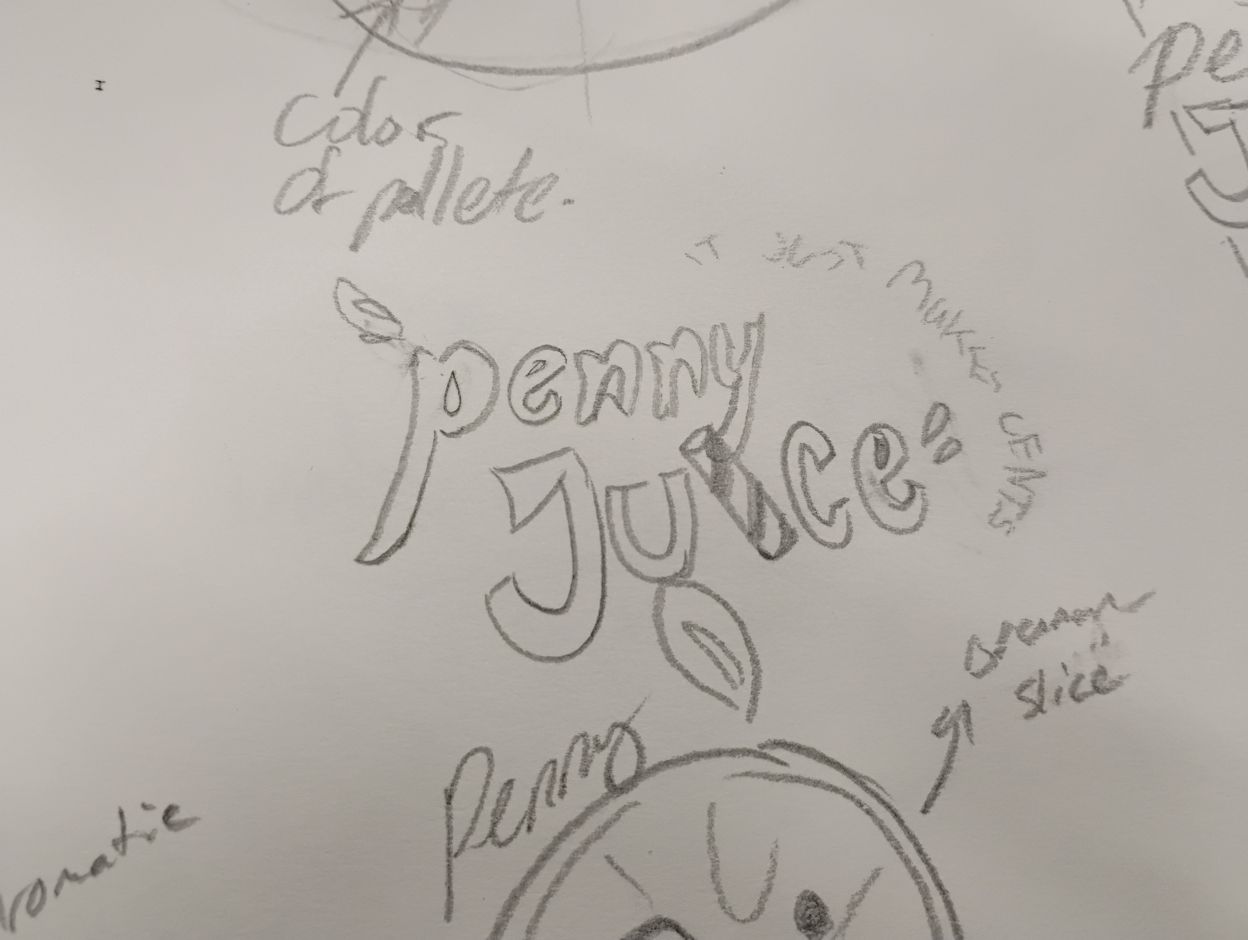
Design Process: Initially, the design went through a couple of typography phases before I landed on the straw or penny design. I hand traced the penny logo and found a font useable for the straw design and I love how clean this looks. They both felt family-friendly and childlike with a bit of professionalism. After receiving feedback from a graphic designer on campus, the words were hard to read from a distance or small scale and part of the “juice” turned into a “w” or lost its readability. There were also some minor inconsistencies and my words on the penny design didn’t line up and looked warped. As well as the straw felt more like a wall when you read it and blocked the flow I was going for. From this process, I didn’t realize that the small details made all the difference.
Website Icons


